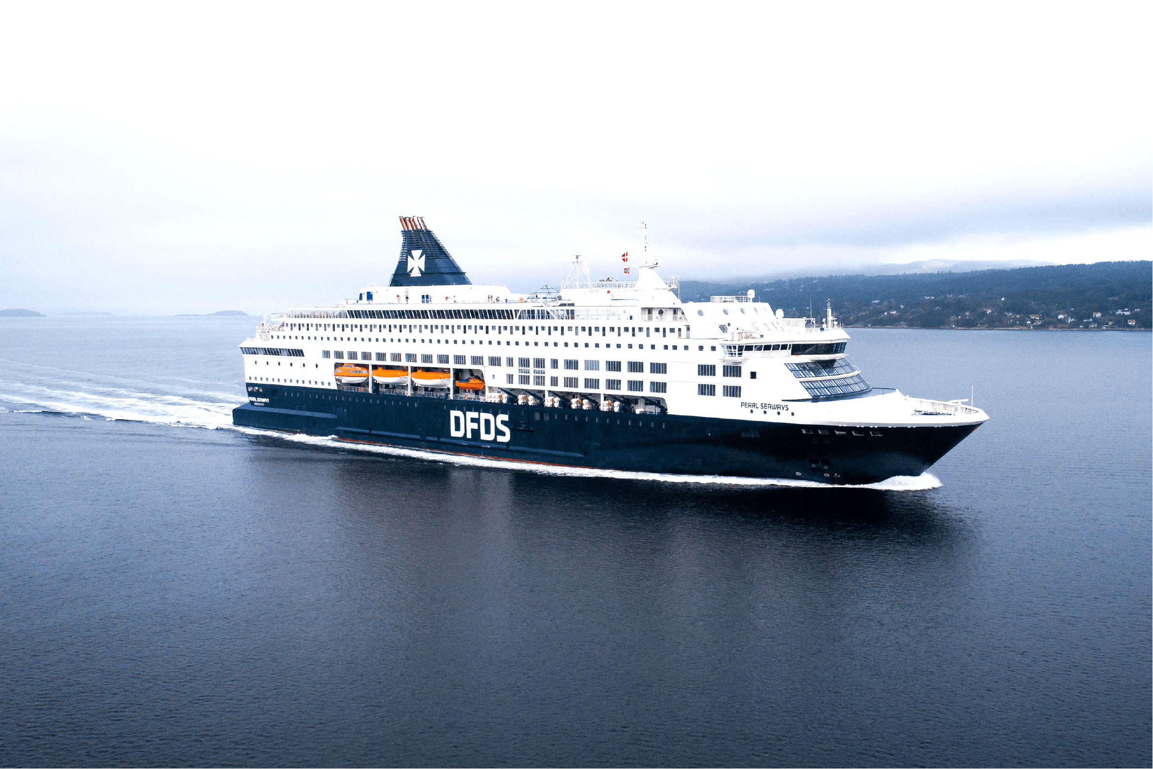
In close partnership with DFDS, Scandinavia’s premier integrated shipping and logistics firm, we revamped their Corporate Visual Identity in alignment with their new unified branding strategy of 2015
Strategy
DFDS sought to consolidate its various sub-brands under a single umbrella: DFDS. This required a refreshed visual identity that embodied their new corporate branding vision, while paying homage to their legacy.
Design
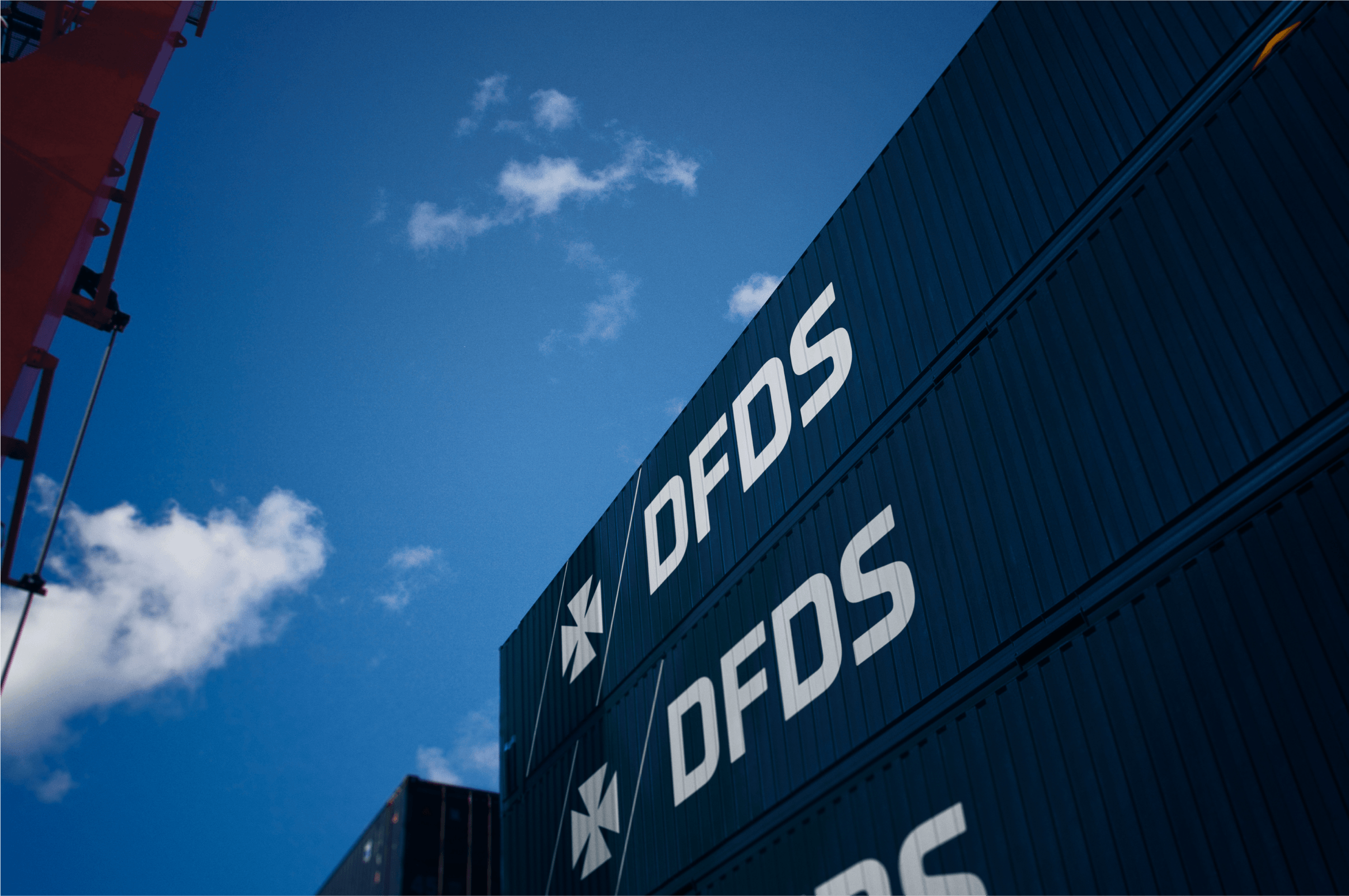
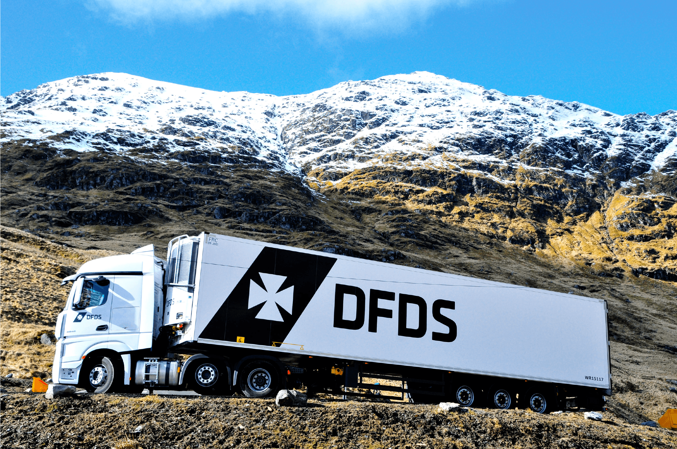
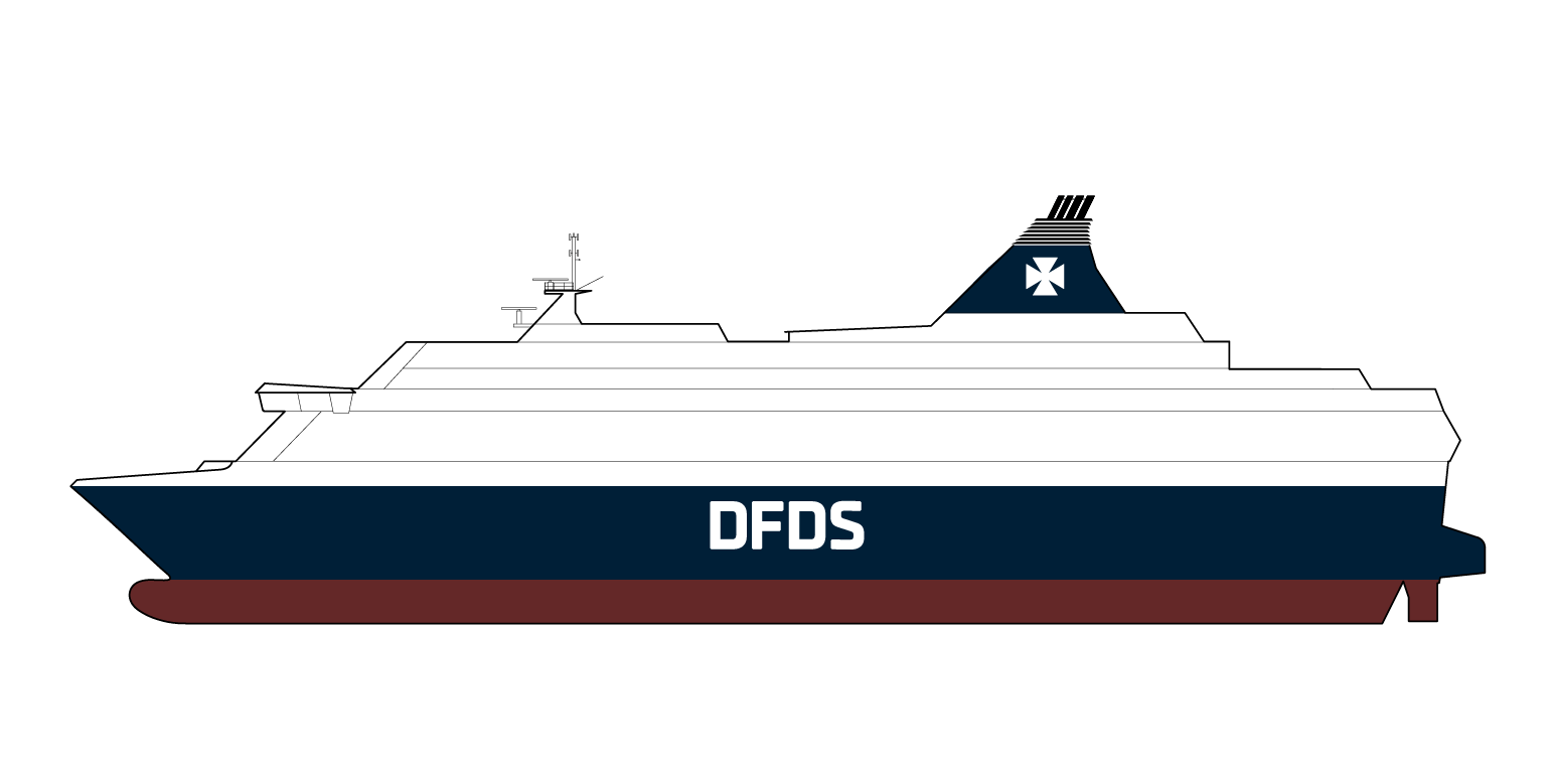
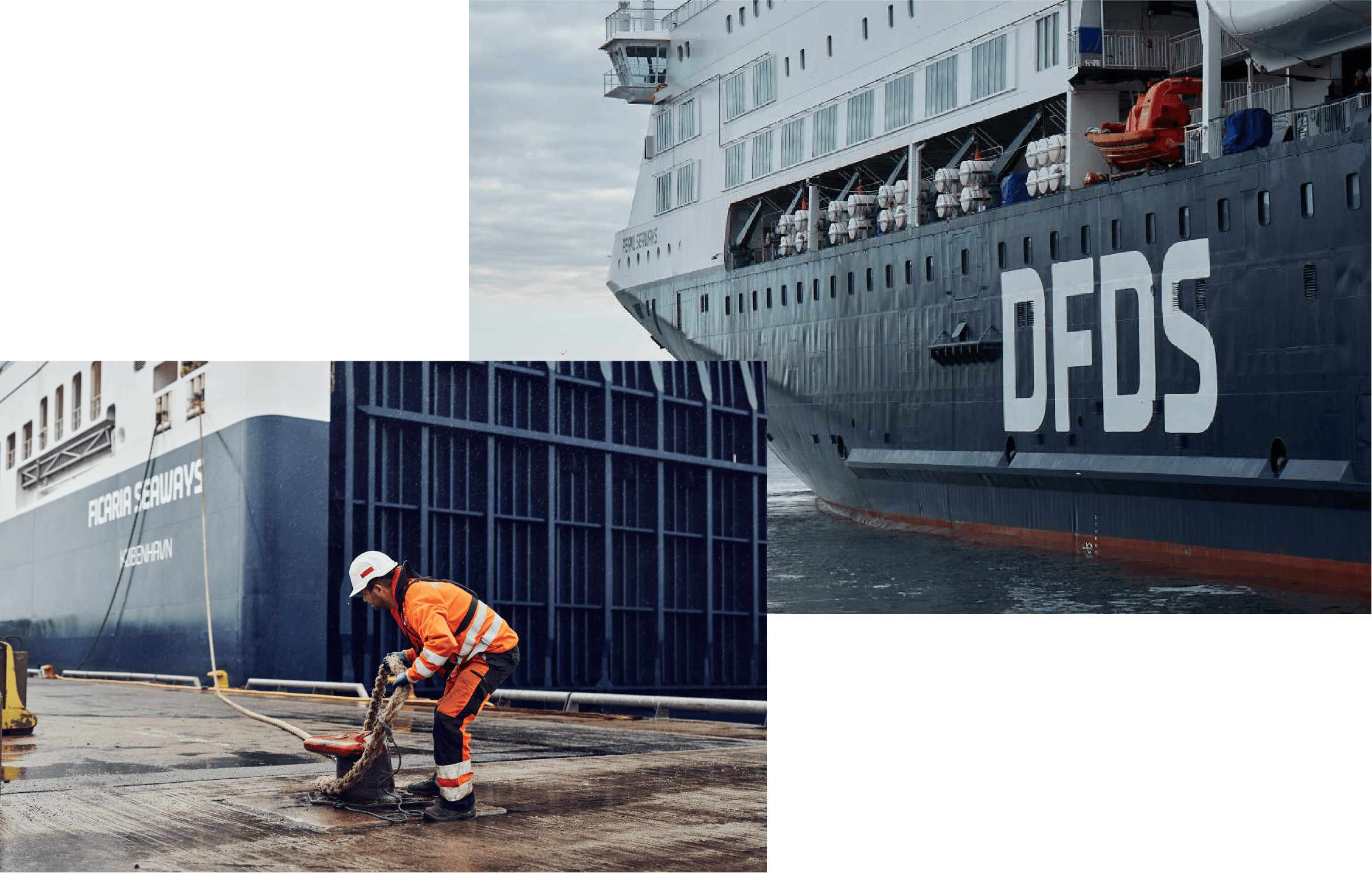
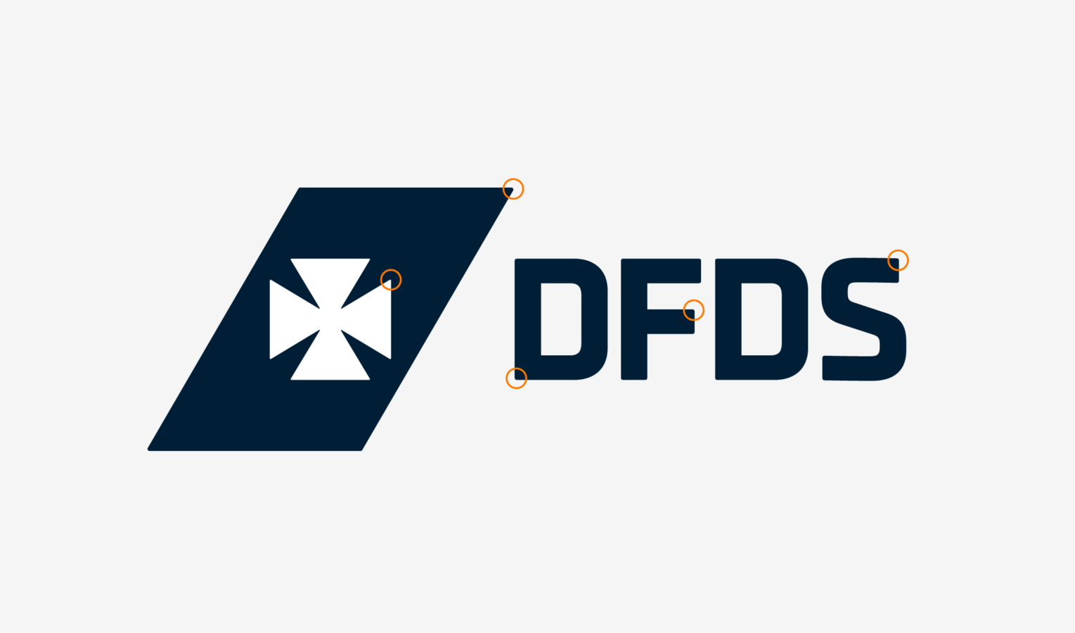
We introduced a cohesive visual framework anchored in simplification. This included a revitalized logo with a refined Maltese Cross, a bespoke brand typeface integrated into the wordmark, and balanced design elements for a harmonious look.
The updated color and graphic systems ensured DFDS remained consistent, robust, and adaptable across all platforms.
Result
By streamlining DFDS’s brand, we established a unified and powerful brand experience for both customers and stakeholders. HEAVY’s partnership as a Brand Advisor with DFDS encompassed diverse facets of the brand journey, from motion graphics and interior aesthetics to external communications and on-board experiences.
- Robert Daniel Nagy
Designer in charge

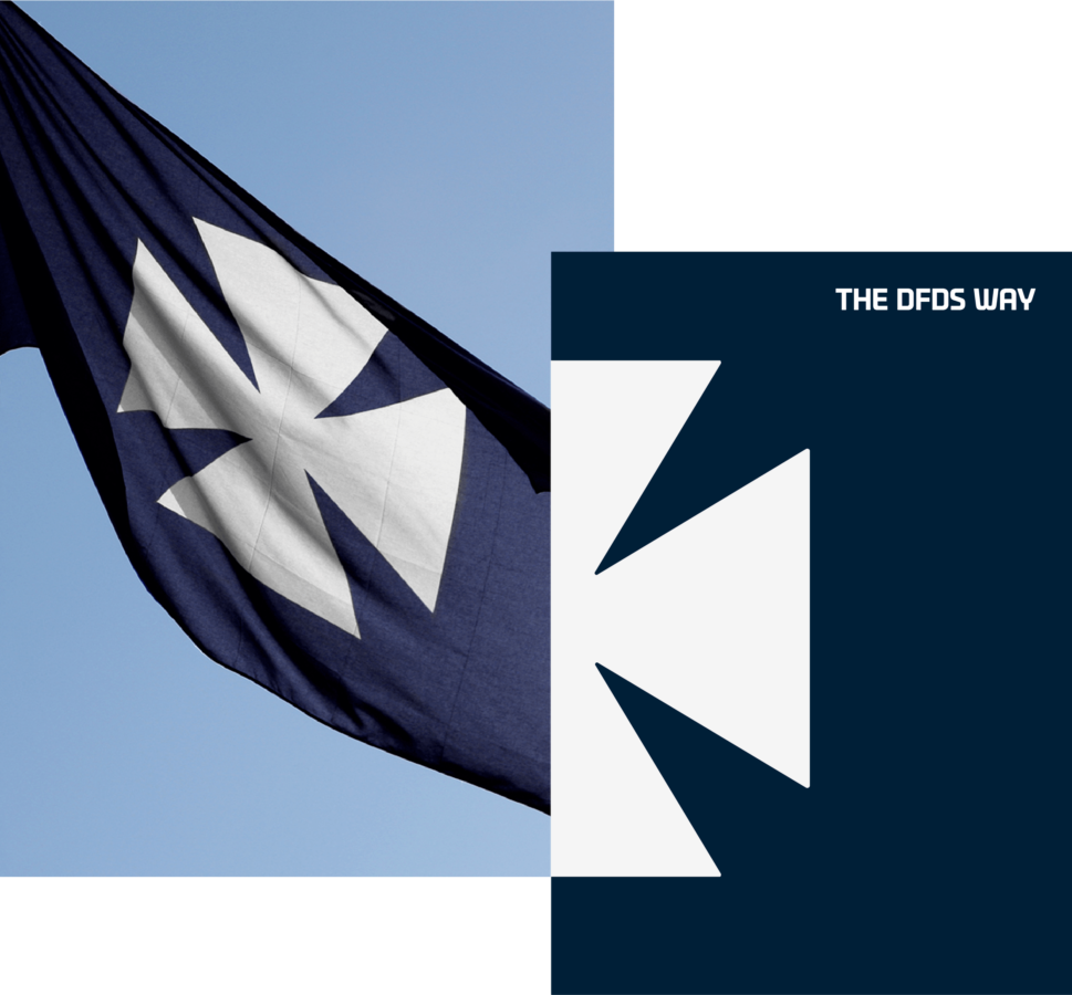

Before and after