CHALLENGE
While most utility service companies highlight the practical features of their products, Fors aimed to reinvent their offerings.
The goal was centered on enhancing customer experience through innovation and improved consultancy.
SOLUTION
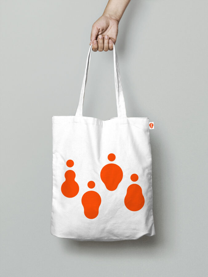
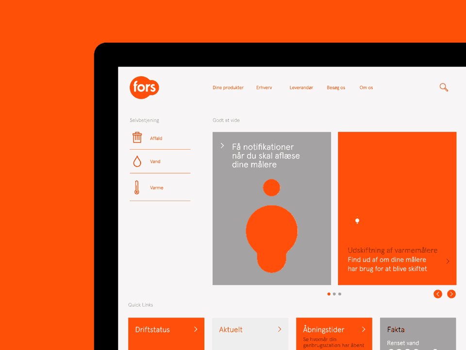
We developed a Visual Identity System to make Fors’ diverse products and services easy to understand. With a strong mark, bold colors and a clear graphic structure.
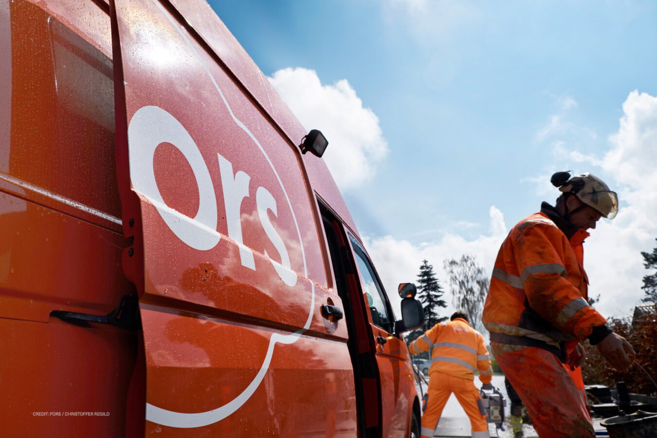
Our dynamic “Droplets” design is a versatile branding tool used throughout their communications. The primary color is a bright orange, paired with a reflective silver, mirroring the attire of Fors’ field workers, grounding the brand in its practical roots.
IMPACT
The new visual identity not only unified Fors’ merged entities but also positioned them as a forward-thinking leader in the utility service sector, resulting in enhanced brand recognition and cohesion across their customer base.
- Phong Thanh Phan
Designer in charge