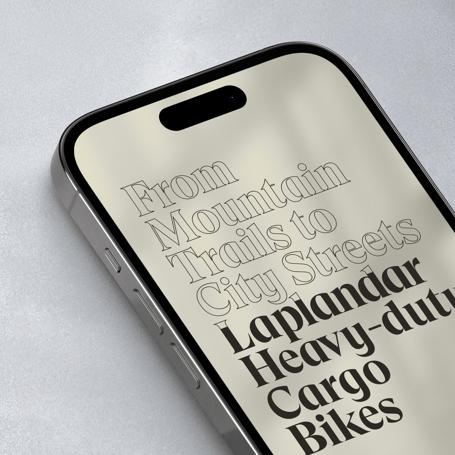
Laplandar is a heavy-duty cargo bike startup redefining the ‘last mile’ of eco-friendly urban deliveries.
Strategy
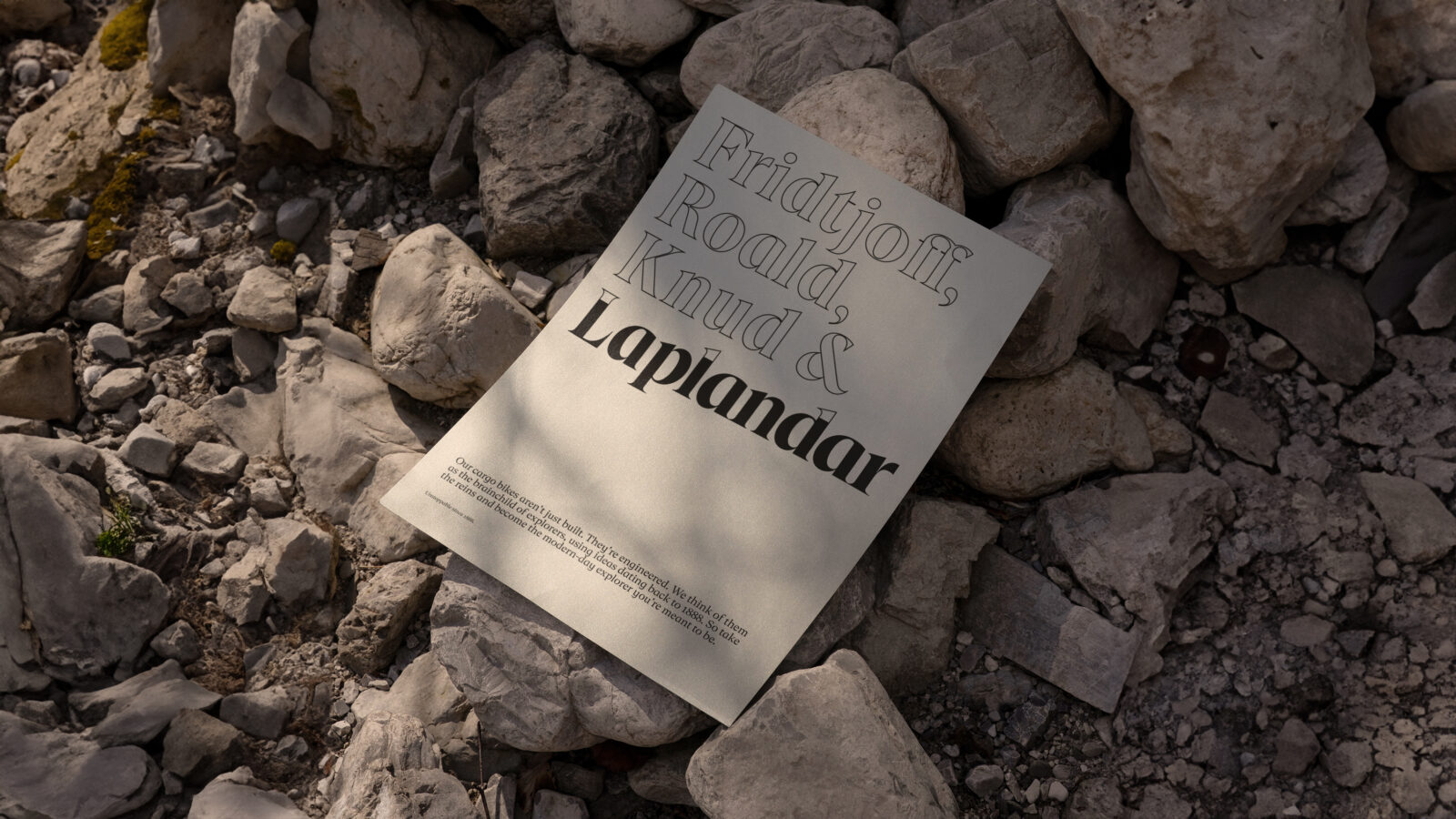
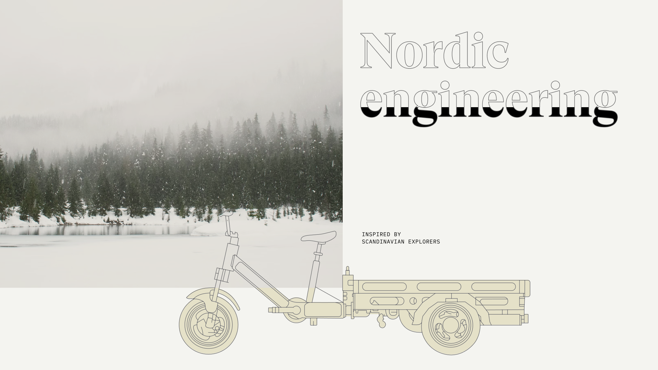
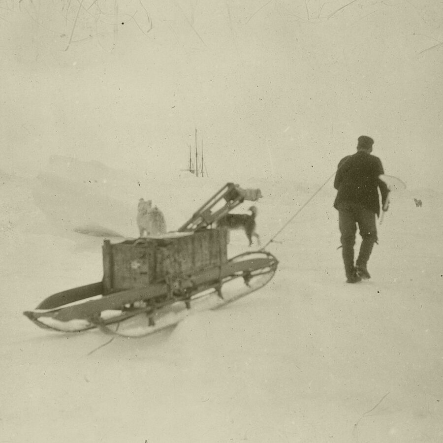
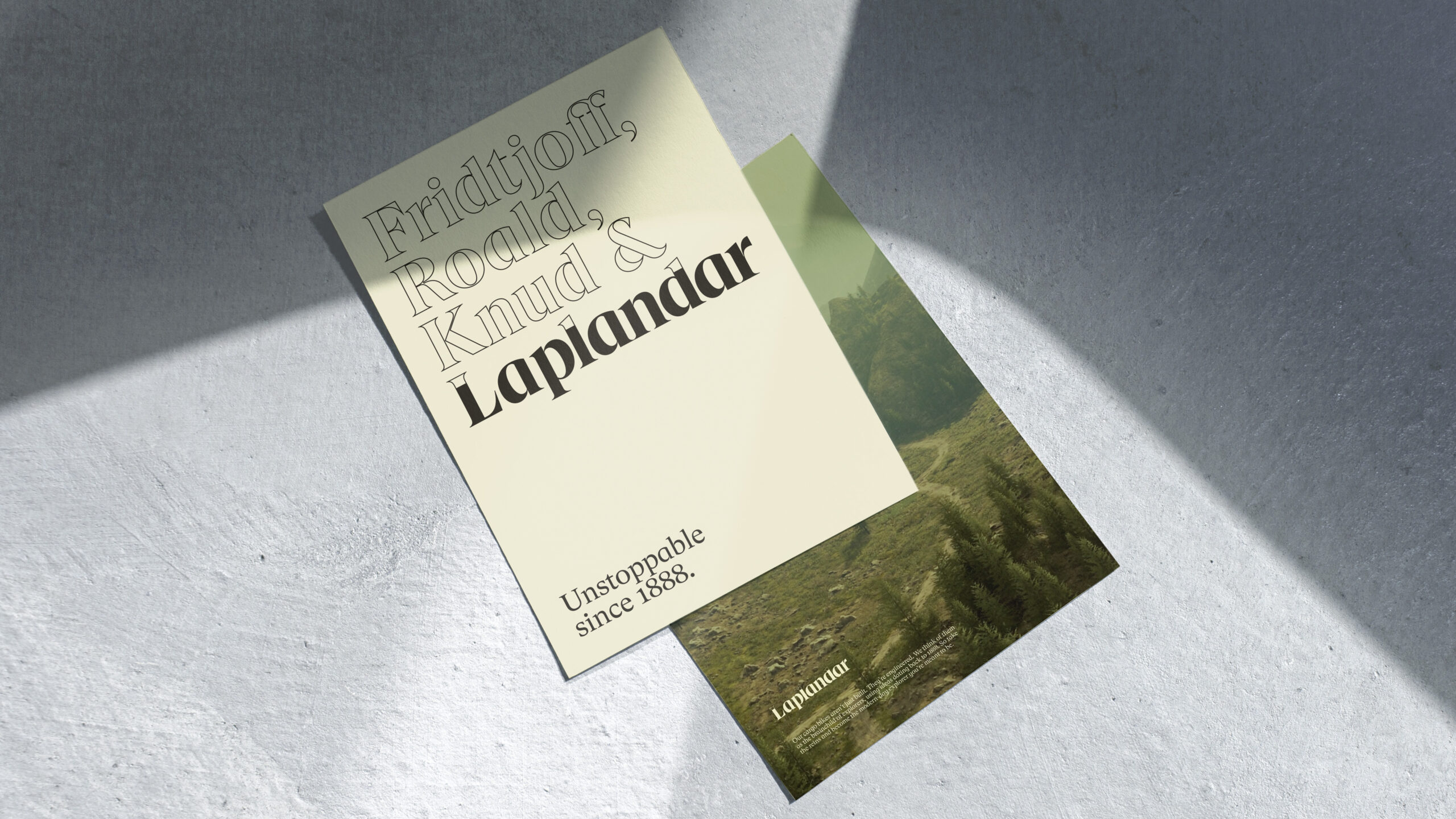
In a market where cargo bikes focused on product features, Laplandar chose to think differently. Instead they wanted to tell about their heavy-duty performance through storytelling and sound engineering basics.
Design
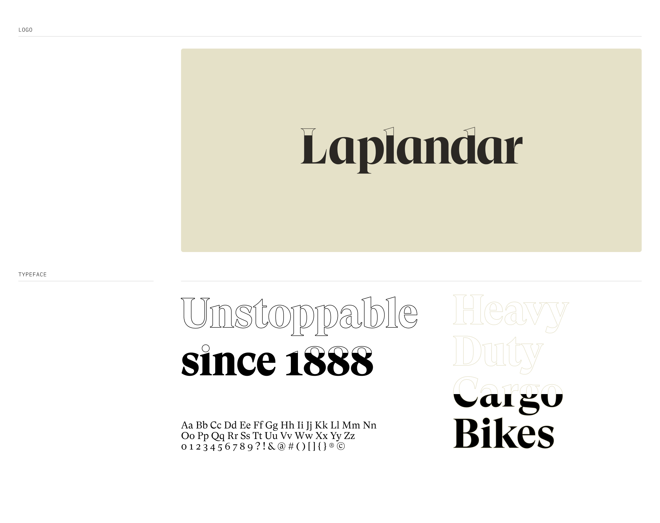
The Laplandar logo features snowy peaks, a nod to its Scandinavian heritage. The visual identity resonates with the exploration spirit and emphasizes the robustness of the product.
Result
Laplandar is making its mark as a sustainable alternative in a sector that’s waking up to its ecological responsibilities. With a strong brand identity that supports this mission, Laplandar is proving that going green doesn’t mean compromising on performance.
- Robert Daniel Nagy
- Phong Phan
Designed by
- Delta Productions Video & Photography
Collaborators
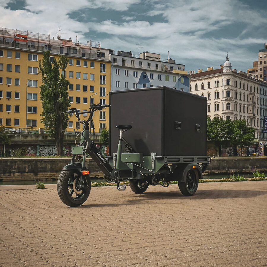
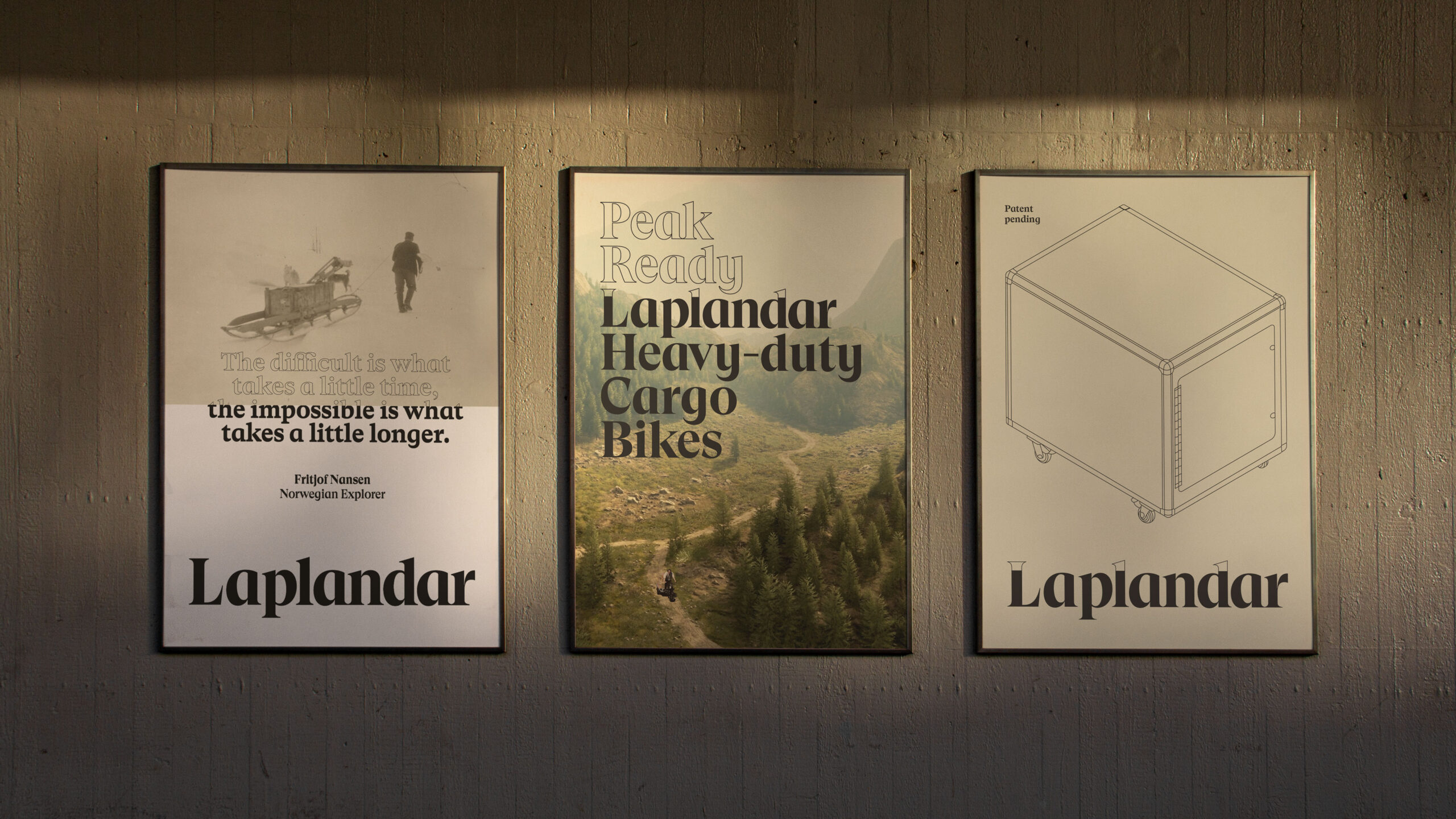
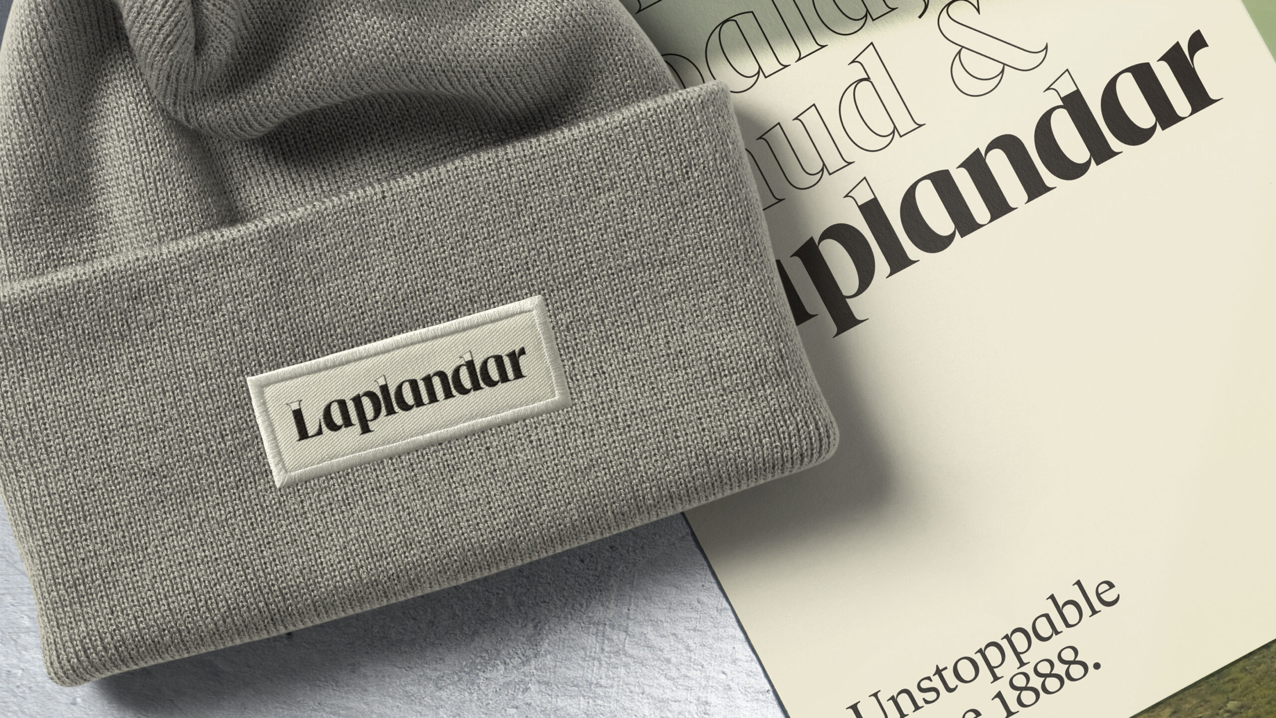
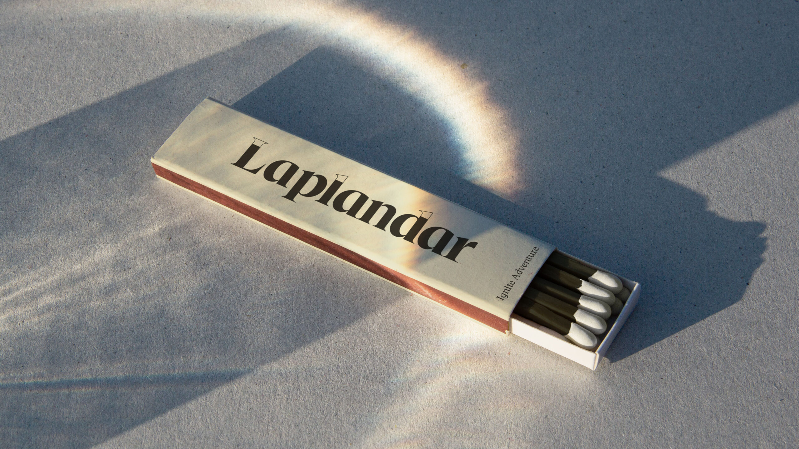
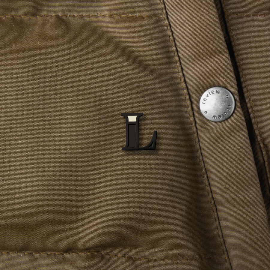
We’ve engineered a brand that’s as agile and flexible as the bikes themselves. The overarching concept provides the latitude for this agility, allowing the brand to adapt and evolve without losing its core essence.
With Laplandar, we’ve given form to sustainability, bridging the gap between tradition and innovation, without compromising on either. In a world inching towards environmental consciousness, design has a pivotal role to play, and Laplandar is a testament to that.
